We’ve stayed at the beautiful Swan Hotel in the Lake District a few times over the years, and often stopped by for lunch. At the bottom of Lake Windermere, close to the central Lakeland fells, it’s an amazing location and has become one of the Lakes’ top hotels.
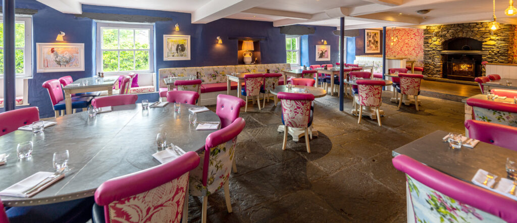
To me however, the stand-out thing about the Swan is its decor. A quirky blend of vibrant contemporary colours and bold patterns, combine with the rustic stone and heavy timbers of a traditional Lakeland building in a pleasingly unconventional way.
So suddenly, while sitting there in the restaurant, pondering what to eat next, came an apple-falling-on-head-moment; “How cool would my animal prints look in here!”
I’m quite fond of bold colours myself, especially when combined with other colours that compliment and accentuate them. Of course, this can be an exercise in judgement and can easily become a bit of a dogs dinner, but the results are striking when it works out.
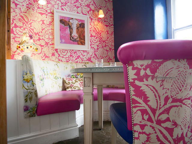
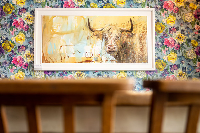
So I put the idea to the people at the Swan and they thankfully agreed that we were a good match. Fast forward a few months and there are now around 25 of my animal canvas prints around the hotel!
I used a broad white frame around the canvases to allow some breathing space between the prints and the colourful walls (the white frames also throw up the colours in the prints), These were placed in various spots where the colours and themes seemed to combine well.
For me, the union works really well. The pictures are strong features in the rooms (rather than wall-fillers) without diluting or confusing the impact of the décor. As we all know, the impression a picture makes is down to more than just the picture itself. The choice of frame, its placement and all the surroundings have a significant effect on the whole and can effectively change its nature quite a lot.
So far the feedback from The Swan has been great but I’d love to know what you think if you’ve been there yourself so please let me know.